How to Confuse with Color
Updated on November 17, 2023
By Pete Freitag
By Pete Freitag
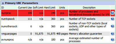
 This screen shot is taken from a Virtuozzo Power Panel, which despite my complaints here, has some nice features for managing a VPS.
As you can see they use a light shade of red for the red zone, and then red for the black zone. At least they are using yellow for the yellow zone - but what is the difference between each zone, I'm guessing that the black zone is the worst (meaning my resources are low), but it just is a very confusing color scheme.

Above is a screen shot example of the coloring in use. The table header, and alternating row coloring don't help things. Also notice the black text on red background - a color contrast no no.
How to Confuse with Color was first published on January 04, 2007.
 Pete Freitag
That's wonderful, in a tragic way.
Maybe you should submit it to the pop-up potpurri category of thedailywtf.com?
-Joe